CREATING A FULL BRAND IN REAL WORLD
Luke got me on board with the redesign of his restaurant brand. He developed a reputation over a decade for a strong gastro menus with a molecular edge. His resources were all locally sourced and the food was playful and, most importantly, very tasty. We needed to match the decor with the food served in the restaurant as well as it’s new brand. 
He created an experience whereby there were stories told through the food presentation, preparation and consumption. Modern sensory fables, rich with meaning and history, opened up to his growing customer base.
We first developed his base logo. Drawing upon fabled elements of the gastro-experience and the Leeds rich food history we created a wedlock of ironmongery and traditional pub artwork into a modern vectored look.
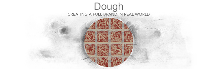
With desire to further enrich the experience we developed a font to accompany the logo. Large capitals, embellished with food iconography would be used a start to the paragraphs, embellishing the whole experience.

The brand look would extend further to other ventures , like the Dough to Go maximising it’s outreach.

The logo would be further amended for special events which Luke held in and outside the restaurant, while retaining it’s established look.
![]()
![]()
![]()
But we didn’t stop there. We also re-created the signage for the outside of the restaurant on the Spen Lane, retro-modernising the outside and crowning it with a large logo mural.

A series of posters was also produced. Harking to the post-war ear of local social action these created a lynchpin with the menus via font and further anchored the notion of local produce and positive (foody) action.

Luke has, since, expanded to three units across Leeds.